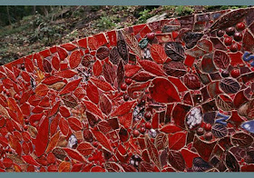
Mt. Top Trio: Violet (side 1) 2008 - 2009 53.5 x 36 x 16.5 inches
(Photography by Russel Hurlburt)
This month, The Tileista (aka JoAnn Locktov) introduces us to ceramic artist Susan Tunick, a woman who makes her own tesserae and uses it to glorious effect in her site-specific sculptures. No less engaging are her more architectural bricks and tiles. Enjoy – Nancie
Ceramic artist Susan Tunick has a penchant for scale and surface. All of her creations, site-specific sculptures, mosaic murals and individual bricks and tiles are testaments to architecture. The surfaces are intricately laced, lush in color and texture. Studying architectural ornamentation has given Tunick a heightened awareness of edges, shadows and context-both physical and historical.
Tunick was inspired to work spontaneously on her recent site-specific commission, Mt. Top Trio: Vert, Violet & Rouge. Located on a 600-acre Vermont farm, the land is fertile with wild flowers and grasses, pear, apple and plum orchards. These are three sculptures that provide permanent landscapes of color.
Mt. Top Trio: Vert 2008 - 2009 53.5 x 36 x 16.5 inches
(Photography by Russel Hurlburt)
Mt. Top Trio: Violet (side 2) 2008 - 2009 53.5 x 36 x 16.5 inches
(Photography by Russel Hurlburt)
Mt. Top Trio: Rouge 2008 - 2009 53.5 x 36 x 16.5 inches
(Photography by Russel Hurlburt)
Detail of Mt. Top Trio: Rouge (side 2)
(Photography by Russel Hurlburt)
Each side of clay bands was created at the same time to insure that they would shrink at the same rate and fit in their respective place. Tunick chose a completely new glazing method that allowed her to “build the colored surface from one firing to the next.” She allowed the color to evolve by glazing non-adjacent elements. By staggering the glazing, she could watch it blossom, a process Tunick compares to “the way a pointillist painting was created.”
Detail of Mt. Top Trio: Vert
(Photography by Russel Hurlburt)
There is a mesmerizing quality to the sculptures. The trio of forms reverberate color perhaps most vividly when seasons are harsh and nature is devoid of any strong hues.
Mt. Top Trio: Violet (side 1) 53.5 x 36 x 16.5 inches
(Photography by Russel Hurlburt)
Cranberry Double Screen 2008 - 2009 6 x 6 x 6.75 inches
(Photography by Malcolm Varon)
On a smaller scale are Tunick’s perforated tiles and brick units. Both forms explore dimension. The perforated tiles are built with layers revealing surprising glimpses of pattern and depth. The perforations are witty reminders to both inspect and respect what lies beneath the facade.
Blue Night 2007 12 x 10 x 4 inches
(Photography by Malcom Varon)
Tunick explores the rectangular brick by forming them in wooden molds, stacking and carving them. Constructed of thick hollow backed slabs glazed in radiant colors, the pedestrian brick is elevated to iconic status.
Klee's Clay #1 2005 15.25 x 9.5 x 3.5 inches
(Photography by Amiaga Photographers)
Corner Bricks 2005 10 x 9 x 4 inches
(Photography by Amiaga Photographers)
As President of Friends of Terra Cotta, a preservation organization devoted to protecting historic and architectural ceramics, Tunick has studied clay in architecture for over 25 years. She is invested in “seeing ceramics re-integrated into our environment…into landscape, interiors and into the facades of new buildings.” Her work represents this evolution precisely.
Mount Kisco, NY 2005-2006
A two-part mosaic sculpture; the front was designed to be visible from the road (about 50 feet away) while the back blends into the landscape
(Photography by Peter Maas)
For more information:
www.susantunick.com
Friends of Terra Cotta
"Tileista" is a monthly column that explores the beauty of artisan tile. JoAnn Locktov is the author of two books (Mosaic Art and Style, The Art of Mosaic Design) and numerous articles on contemporary mosaics. Her public relations firm Bella Figura Communications represents individuals and businesses in the visual and literary arts. Follow her musings on design, tile and Italy on Twitter:
http://twitter.com/jolocktov
www.bellafiguracommunications.com
To see previous posts by The Tileista on MAN, use the Search widget in the right hand column and type "Tileista"


Fabulous sculptures. I love the walls; imagine if landscapers incorporated these kinds of beautiful pieces in our public gardens, of if concrete barriers dividing highways could look like this.
ReplyDeleteWow, I just love the structure on mount Kisco. Wish it would be easier to visit myself, since I come from Holland. Susan Tunick's amazing, of course.
ReplyDeleteNice article,
Monica
Maureen - I often think the same thing as I drive the highways of California. There are some mosaics and mosaicy kinds of things, but they're few and far between.
ReplyDeleteMonica - I have been loving that Mount Kisco installation for a couple of years now. Thanks to the Tileista's taste in tile, I was able to insert these images into her post. She knows where all the good stuff is!
ReplyDeleteI had been out of touch with Susan and her work for many years - thanks so much, JoAnn and Nanci for this wonderful re-introduction. The work is both bold and subtle. The sculptures so much at home in their environment - like David Smith's steel totems out in their sloping fields. You're right, Maureen. While Susan's work is all about hand-made, I'll be she could figure a way to produce on a highway scale.
ReplyDeleteI have always admired Susan's artwork. Her use of color is inspiring. I love how the color of her Cranberry Double Screen reflects onto the surface of the wall, simultaneously changing actual and perceived space. Thanks for bringing her work to our attention.
ReplyDeleteWe have the Tileista to thank for bringing Susan's work to MAN. She has a knack for finding the most splendid things and people.
ReplyDelete