However, we do know an exceptional classical mosaic when we see one. And we saw one at the Society of American Artists (SAMA) Mosaic Arts International Exhibition in Chicago. It was "Elephant Eye" by Sandra Groeneveld.
 Elephant Eye 15" x 17.5" inches Marble, smalti
 Elephant Eye Detail shots
This is a contemporary mosaic where subject matter, material and technique are all in accord. The result: a captivating image that doesn't just look like an elephant -- it feels like one. The andamento is superb. It flows and folds like the skin of an elephant. The composition is arresting. That red eye is in the "sweet spot." And anyone who remembers the fable of the blind men and the elephant can see that the texture of the marble beautifully mimics the texture of elephant hide.
No surprise that Elephant Eye was one of the first mosaics in the exhibition to be sold.
We contacted Ms. Groeneveld to learn more about this work. She was kind enough to provide us with the wonderful insights below. She also gave us permission to replicate her work in progress content about Elephant Eye from her website. It is an excellent resource for mosaic artists and aficionados. Our thanks to Ms. Groeneveld for her generosity in sharing her creative process.
Enjoy -- Nancie
I believe every piece of art you make is just a step on a path made up of all the work you previously did. My “Elephant Eye” was one of those satisfying larger leaps you sometimes get when lots of little steps build up momentum.
It is important to me to learn the rules before attempting any bending or breaking of them. The placement of the individual tesserae in ancient works -- how they move and flow, fascinates me. My self-study reached an “aha-moment” when at SAMA 2008 I took the course “Designing in Andamento” with Carolina Zanelli. She made us copy and plan out andamento on paper. Cutting (tesserae) did not hamper the experience; you just needed to think, plan, and draw. She explained principles of why things work and how they are used in various mosaic styles.Bubu in BU 10.5" x 6.5" Smalti
This invaluable class was followed at SAMA 2009 with “Mosaic Expressions” with Matteo Randi and “Classical Andamento” with Gary Drostle. Each course was carefully chosen to build upon the knowledge gained the year before.
In order to practice these new found theories, I started a series of mosaics, limiting myself to a strict 10.5” x 6.5” dimension in order to keep things moving. Each piece explored a particular aspect of andamento. How does it help define shape? How does it help define movement? How can I use it to express what I “feel” when I draw?
Whatever visual piqued my interest on a given day became the next subject; my cat’s stare, Arthur Clennam’s eye in half shadow in Masterpiece Theatre’s “Little Dorrit”, a backlit lizard on my window screen ...Eye Studies Marble, smalti.
The texture of skin in the black and white photographs of elephants I saw on the PBS Nature documentary “Unforgettable Elephants” gave me a vision. The play of light, the texture of the skin, the shape of the skull: they are all real but abstract in their own way. I saw an image clearly in my mind, and all the steps of the previous year had prepared me to execute it.
Sandra Groeneveld 4/19/10
What follows is Ms. Groeneveld's Work In Progress series from her website.
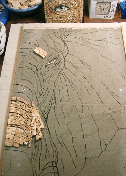
After research for details and to get a feel for the shape and volume of the head, I start with a small sketch to nail down the view I see in my mind. Then I place colored paper around the sketch to get the final composition ... just the right amount of trunk, ear, forehead, tusk for the right level of tension.
The initial sketch is enlarged and then redrawn with more detail, working out where I want emphasis and direction.
I experimented with different kinds of marble of various sizes in order to get a mix of textures for the elephant's skin. The hammer & hardie are again my main tools for shaping the stone.
After transferring the drawing to a prepared backerboard, I dryfit some pieces to get a feel for color as well as how the various textures and sizes will transition.
In order not to loose sight of the highlights, I decided to paint them on. Later I added some shadow areas for the opposite side of the spectrum.
With the initial dryfit testing, I had the most fun with the trunk, so that is where I started in earnest.
After establishing the trunk, I moved on to the ear, which I wanted smooth and flat. The forehead was to become the meeting place of the two textures, where the skin is stretched smooth by bone.
The tusk and background was dry fit with some variations until I found the combo I liked best. A previous test on a human eye was my inspiration to keep things loose and painterly.
The eye is always key. Mess that up and the animal has no life, no focus. Like a game of "Operation", I work the pieces in the eye until I am pleased. I take a picture for reference & place the pieces aside before reassembling it with mortar. I only do this lengthy process with crucial sections.
After the piece is finished and has cured for a few days, I give it a good scrubdown to remove all debris. This brightens up the colors nicely and is the last step before trimming off the excess on the sides.


Again, our sincere thanks to Ms. Groeneveld for sharing so many details of her creative process. To learn more about her work go to: http://www.kalideco.com/mosaic/index.html* * * * * *Call to Artists for Mosaic Art NOW's 2011 Exhibition in PrintFeaturing Multiple Works from Individual Mosaic Artists Selected by an International Panel of Jurors
Two $500 Prizes
Deadline: October 1, 2010
Mosaic Art NOW (MAN) publishes a high quality, four-color annual designed to promote contemporary mosaics and the artists who create them. Through the publication, blog, Facebook Page and Twitter, MAN reaches thousands of mosaic artists, collectors, designers, architects, curators, and advocates around the world. The Exhibition in Print (EIP) is the highlight of each annual publication. It is designed to replicate the experience of visiting a mosaic exhibition in a fine art gallery or museum.
This year, each selected artist will be represented in the publication by a four-page article similar to the example below. Included in each article will be photographs of multiple works, an artist's statement, in depth descriptions of each mosaic, and jurors' comments. MAN 2011 will be released in mid-February 2011.

To see the Sample Article in more detail, click here
Jurors
Prospectus & Entry Forms:
- Bernice Steinbaum, PhD, The Bernice Steinbaum Gallery, Miami, FL , noted gallery owner, artist representative, educator, author, juror and advisor to museum, corporate and individual collections; (http://www.bernicesteinbaumgallery.com/)
- Emma Biggs, internationally acclaimed mosaic artist, teacher, and author and Matthew Collings, artist, historian, writer and arts broadcaster for the BBC.http://www.emmabiggsandmatthewcollings.net/
Available in English, Italian and French at: http://www.mosaicartnow.com/Exhibition.aspx(more translations to come.)

Goodness, that elephant is just perfect. Amazing, thank you for showing it to us and congratulations to Sandra!
ReplyDeleteGreat post and so informative. Thank you.
ReplyDeleteThis is an invaluable insight into the creative process of mosaic art.
ReplyDeleteBeautiful piece! I have a question, being new to using smalti, marble, or any other traditionally "not grouted" material-- what is the black that is visible in the gaps between the tesserae-- is that ink or paint on the substrate? Also, in the assembly pictures above, the gaps look black. But in the scrubdown picture (2nd from the bottom, above), all the gaps look white. Then in the finished picture, the gaps are again black. What is it that makes the gaps look white in the scrubdown picture? I'd be grateful for any insight!
ReplyDeleteHi Karyn - We don't have the answers to your questions, but Sandra does! Why not contact her through her website? Glad you've found this post helpful! Nancie
ReplyDeleteThis is a fantastic collection. I like the designs.
ReplyDeleteThank you for your kind remarks ... I can answer Karyn's questions here:
ReplyDeleteThe black in the gaps is the mortar I used to adhere the marble. I tint it with pure black powdered pigment to the shade I want for the piece after doing a series of value tests. I mix up the same ratio with each session of work for a consistent value.
The white in the gaps in the scrub-down shots is just bubbles from the bath. After rinsing, they of course go away.
Thanks again,
sandra
Hi Sandra, I found this post vis-a-vis Bonnie Mitchell's facebook page (where DM makes frequent comments) and I just had to say (after visiting your website) how incredibly beautiful I find your work. Congratulations on finding a medium that suits you and on translating your talent into a marketable product... I love your dragonflies and the knots and your elephant is just extraordinary!
ReplyDeleteI shared this post with my Ancient Meets Modern students and they found it very helpful to see the step by step, the under drawings, the raw stone become andamento. Beautifully done. Consider tagging this post under the learning experiences category of blog. That's where i went to look for it. Thanks again!
ReplyDeleteAbsolutely amazing creation! I love the shading!
ReplyDelete